Logo Usage

Symbol

A destination before your destination..

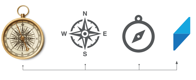
Considering Riyadh Airport as a destination for the traveler before going to his country destination. We have created our symbol as a simplified icon representing the compass, which is a tool you can use to reach the intended destination. We have created it out of 2 triangles, separating them by different shades of blue. Our symbol illustrates the destination, and the direction of your journey!
Symbol
Symbol

Logo

Our logo is simple, modern, straightforward, and futuristic.

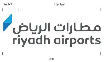
It is made out of a combination of the logotype and the symbol, where the symbol is a composition of opposite triangles. Through its bold aspect, the logotype for Riyadh Airports logo projects the strength of this product, while its sharp traits highlight the confident spirit of the brand
Logo 2
Logo 2
Logo 3
Logo 3

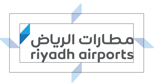
Minimum Clear Space

Always maintain the minimum clear space around the logo to preserve its integrity

To maintain visual clarity and to provide maximum impact, the logo must never appear to be crowded by copy, photographs or graphic elements. The minimum clear space must never differ proportionally from the diagram demonstrated on this page. The minimum clear space around the logo equals (x/2), which is the size of the symbol divided by 2 (one triangle).

Logo 1
Logo 1
Logo 2
Logo 2

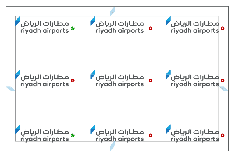
Logo positions

On any given format—landscape or vertical,

the preferred placements for the logo are the left corners of that space, and the centers of these positions. We avoid having the logo in areas not specified in the reference.

Error Logo
Error Logo

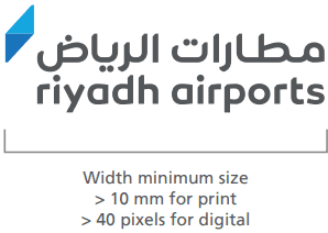
Minimum logo size

To protect the legibility and impact of our logo,

it must never be reproduced in a size smaller than the one shown on this page. In a print environment, the minimum size of the logo should be at least 10 mm In a digital environment, the minimum size of the logo should be at least 40 pixels

Logo Positions
Logo Positions

Incorrect logo usage

Manipulation of the logo is not permitted in any way, shape or form.

To maintain the integrity of the logo, and to promote the consistency of the brand, it is important to use the logo as described in these guidelines. The examples shown here illustrate possible misuses of the logo to be avoided.

Don't create a logo lockup with text

Don't create a logo lockup with text

Don't stretch the logo

Don't stretch the logo

Don't rotate the logo

Don't rotate the logo

Don't rearrange the logo elements

Don't rearrange the logo elements

Don't outline the logo

Don't outline the logo

Color Usage

Primary colors

Core brand colors

Pantone 3005 C

HEX #2574BB

RGB 37 116 187

CMYK 80 38 0 27

Pantone 2745 C

HEX #414E8C

RGB 65 78 140

CMYK 54 44 0 45

Pantone 2189 C

HEX #0E547D

RGB 14 84 125

CMYK 89 33 0 51

Secondary colors

Complementary brand colors

Pantone Bright Red C

HEX #EF4129

RGB 239 65 41

CMYK 0 73 83 6

Pantone Purple C

HEX #502C84

RGB 80 44 132

CMYK 39 67 0 48

Pantone Bright Orange C

HEX #F26122

RGB 242 97 34

CMYK 0 60 86 5

Typography Usage

English Typography

Aa

Frutiger LT Roman

AaBbCcDdEeFfGgHhIiJjKkLlMmNnOoPpQqRrSsTtUuVvWwXxYyZz
1234567890!@#$%^&*()_+='/\"

Aa

Frutiger LT Bold

abcdefghijklmnopqrstuvwxyz
ABCDEFGHIJKLMNOPQRSTUVWXYZ
1234567890 ~!@#$%^&*()-+='/\"

Typography Applications

Font 1
Font 1

Incorrect Usage

Font 3
Font 3